
Japanese woodblock prints, particularly from the ukiyo-e school, captivate with intricate details and striking colors. While indigo traditionally dominated the blue palette, the early 19th century saw a dramatic shift with the introduction of a new, brilliant hue. This brought Prussian blue Japanese woodblock prints to prominence, showcasing a fascinating chapter in art and trade history.
This European pigment, first synthesized in Berlin in the early 18th century, offered a vibrancy and stability unmatched by traditional plant-based dyes. Its adoption by renowned artists like Katsushika Hokusai fundamentally altered the visual language of the period. Understanding its journey to Japan reveals complex networks of cultural exchange and technological innovation.
Before its arrival, Japanese artists relied heavily on natural dyes with inherent limitations in colorfastness and intensity. The quest for more stable and brilliant pigments was constant, and the new blue offered a compelling solution to many artistic challenges.
The introduction of such a distinctive foreign material into a seemingly closed society highlights the subtle ways cultures interacted, even under strict controls. This pigment’s journey reflects a broader narrative of scientific discovery influencing artistic expression across diverse geographic landscapes.
We will delve into how this color reached Japan, overcoming political barriers, and explore the artistic reasons for its enthusiastic embrace by ukiyo-e masters. The technical advantages of Prussian blue quickly became apparent, offering a robust chemical structure for bold new compositions and a wider range of blue tones.
Ultimately, the story of Prussian blue ukiyo-e is a testament to human ingenuity and artistic exchange. It demonstrates how a single material can bridge cultural divides and leave an indelible mark on art history, prompting a re-evaluation of “traditional” Japanese art as an isolated phenomenon.
How Prussian Blue Reached Japan in the Early 19th Century
Japan maintained strict isolationist policies, known as Sakoku, for over two centuries, severely limiting foreign trade and cultural exchange. However, a narrow window of interaction remained open through the Dutch East India Company (VOC) at Dejima island in Nagasaki. This was the primary conduit for a range of European goods and knowledge, including new pigments.
Prussian blue, or bero-ai as it became known in Japan, likely arrived through these Dutch trade routes. It was initially imported in small quantities, possibly as a curiosity or for specific scientific illustrations. The pigment’s superior qualities quickly caught the attention of those involved in various crafts.
Scholars believe the first significant influx occurred around the 1820s, coinciding with a growing demand for new colors in the booming ukiyo-e market. This period saw Japan’s aesthetic sensibilities broadening, influenced by limited exposure to Western scientific and artistic ideas. The availability of this synthetic pigment in Japan marked a quiet revolution for local artists.
Despite the restrictions, information and materials still trickled into the country through unofficial channels and contraband. Some historians suggest that Chinese merchants, who also had limited access to Nagasaki, played a role in distributing the pigment further inland. This complex web of trade ensured that Prussian blue eventually permeated the Japanese art scene.
The pigment’s arrival was a gradual infiltration, demonstrating the porous nature of even stringent isolationist policies. Dutch ships brought various goods, including scientific instruments, books, and sometimes art supplies, to Dejima. While carefully scrutinized, smaller materials like pigment powders could pass through, allowing for subtle cultural infiltration.
Initially, the high cost and limited supply made Prussian blue a luxury item, likely reserved for elite artists or special commissions. As trade routes became more established and demand grew, its availability increased, leading to broader adoption. This gradual market penetration was crucial for its widespread use in Prussian blue Japanese woodblock prints.
The curiosity surrounding Western knowledge, known as Rangaku or “Dutch Learning,” also played a role in the pigment’s acceptance. Japanese scholars and artists were eager to learn about new European technologies and scientific advancements. This intellectual openness facilitated the embrace of new materials like Prussian blue.
Why Japanese Printmakers Adopted It Over Traditional Indigo
Traditional indigo, derived from plants, had been the staple blue for centuries in Japanese art. While beautiful, indigo presented several challenges for woodblock printmakers, particularly regarding color consistency and lightfastness. Its natural origins meant quality and hue varied significantly, and it tended to fade over time, often shifting to a duller, brownish tone.
Prussian blue ukiyo-e artists found a compelling alternative. This new European pigment offered a stable, intense blue that could be applied with greater control and achieved deeper saturation. As a synthetic pigment, it provided uniform, predictable color batch after batch, allowing for greater artistic control and ensuring prints matched the artist’s vision.
Its superior lightfastness meant prints retained their brilliant blue hues longer, preserving the artwork’s original vibrancy. The pigment also allowed for a broader spectrum of blue tones, from pale washes to deep blues, expanding expressive possibilities. Finally, its sheer intensity and brilliance were unmatched, creating a striking visual impact that captivated audiences.
Chemical Composition and Properties That Made It Attractive
Prussian blue, chemically known as ferric ferrocyanide (Fe₄[Fe(CN)₆]₃·xH₂O), is a complex inorganic pigment. This unique chemical structure gives it an unparalleled deep blue hue and high tinting strength, distinguishing it from all natural blue pigments. These properties were a significant upgrade for artists.
Its fine particle size allowed for smooth, even washes and sharp, detailed lines, perfect for the precision needed in woodblock printing. This characteristic, combined with its excellent lightfastness, meant artists could achieve vibrant, lasting colors. The pigment’s stability was a key factor in its appeal to Japanese printmakers.
| Property | Description | Artistic Advantage |
|---|---|---|
| Chemical Stability | Inorganic, resistant to atmospheric degradation | Preserved color vibrancy over time |
| Lightfastness | High resistance to fading from light exposure | Prints retained original intensity longer |
| Particle Size | Extremely fine, allows for even dispersion | Smooth washes, sharp details in prints |
| Tinting Strength | High, produces strong color even when diluted | Economical use, wide range of blue tones |
| Opacity | High covering power | Rich, saturated colors with less pigment |
| Water Insolubility | Does not bleed when wet | Clean lines, precise color separation for layering |
Analytical Methods Used to Confirm Prussian Blue in Print Collections
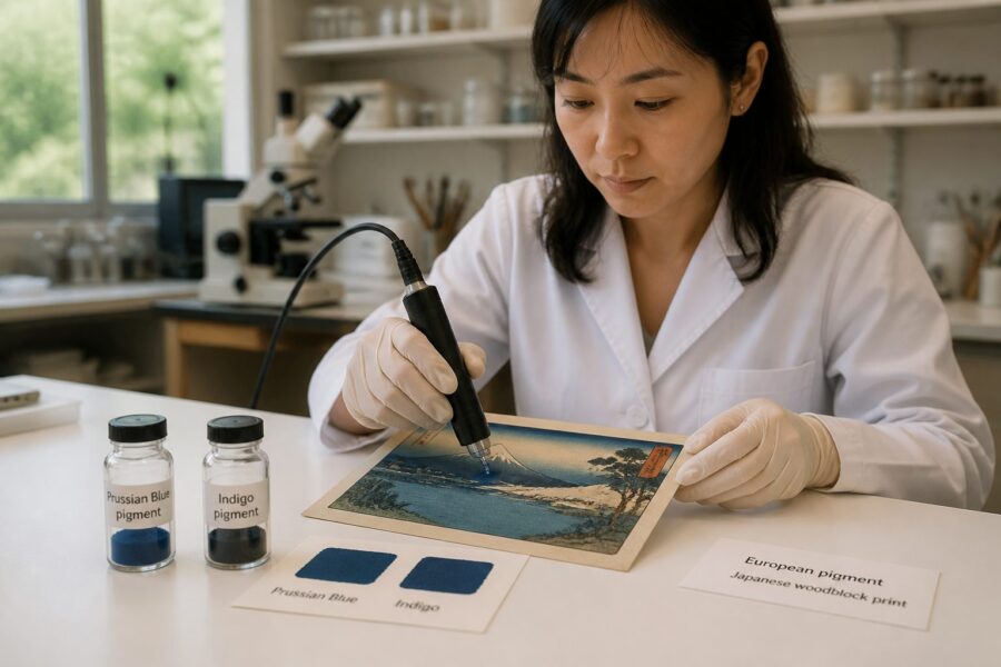
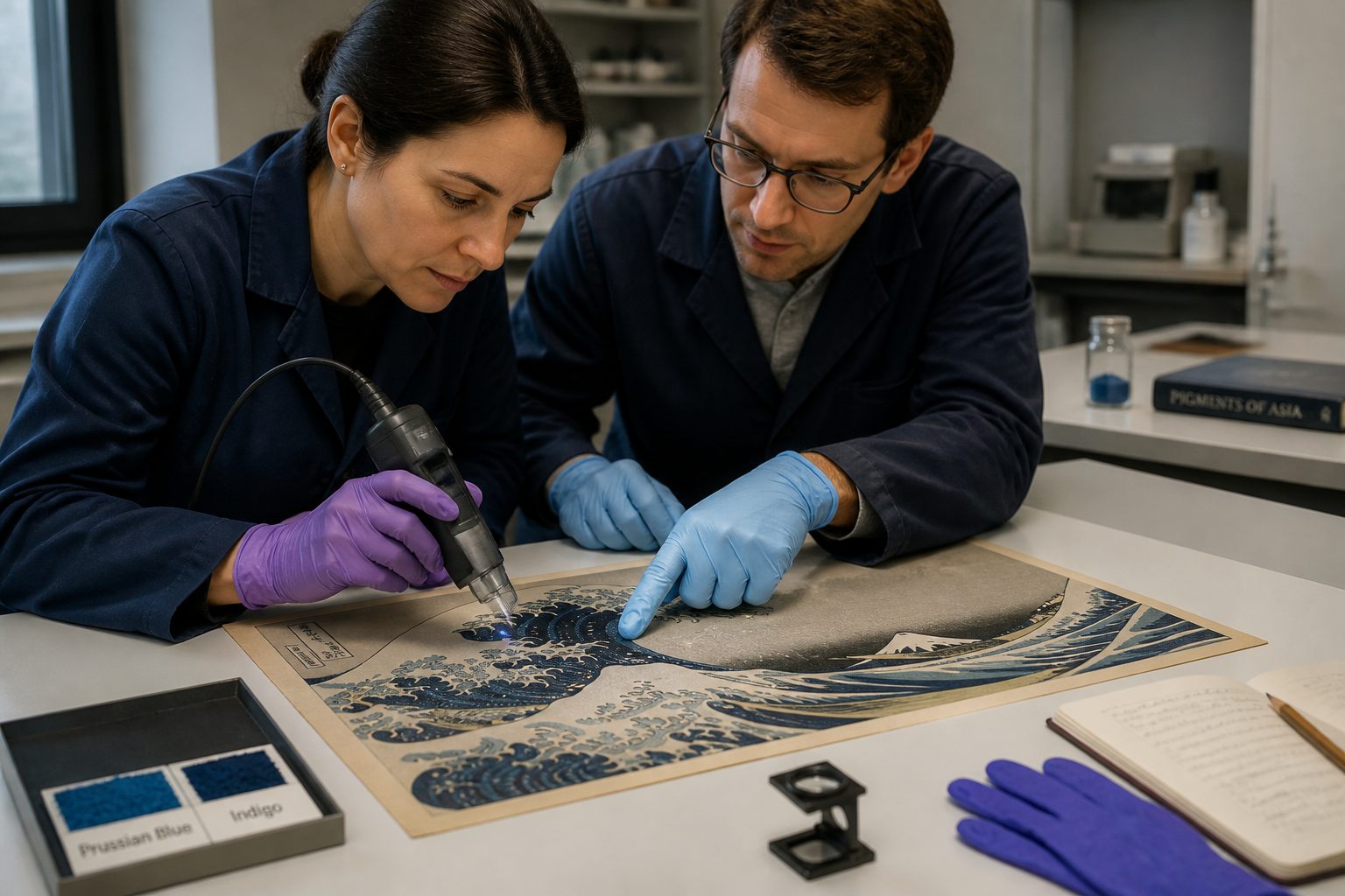
Confirming the presence of Prussian blue in historical Japanese woodblock prints requires sophisticated scientific analysis. Conservators and art historians rely on a suite of non-invasive or micro-invasive techniques to identify pigments without damaging the precious artworks. These methods help precisely date and authenticate various prints.
One common technique is X-ray Fluorescence (XRF) spectroscopy, which identifies elemental composition by bombarding the sample with X-rays. Prussian blue contains iron, which produces a distinct XRF signature, allowing for its positive identification. This method is excellent for detecting iron-based pigments directly on the print surface.
Raman Spectroscopy is another powerful tool, using laser light to reveal the molecular structure of pigments. Prussian blue exhibits a characteristic Raman spectrum due to its iron-cyanide bonds, providing a definitive molecular fingerprint. This technique can differentiate between various blue pigments, even those with similar elemental compositions.
For more detailed analysis, micro-samples are sometimes taken for techniques like Fourier Transform Infrared (FTIR) spectroscopy or Scanning Electron Microscopy-Energy Dispersive X-ray (SEM-EDX). FTIR identifies organic and inorganic components based on their vibrational modes, while SEM-EDX provides high-resolution imaging and elemental mapping. These micro-invasive methods offer granular insights into pigment layers and composition.
These analytical approaches have been instrumental in definitively identifying Prussian blue ukiyo-e, confirming its widespread adoption in 19th-century Japan. Such scientific evidence provides a solid foundation for art historical studies, accurately tracing the pigment’s use across different workshops and artistic periods. This precision reveals how technical choices influenced artistic expression.
Another technique, Reflectance Spectroscopy, measures the light reflected from the pigment, providing spectral data that can be compared against known pigment libraries. This non-destructive method helps characterize the color and differentiate between various blue compounds. It is especially useful for quickly scanning large collections.
Hyperspectral imaging also offers a way to map the distribution of pigments across an entire print, revealing subtle variations in composition and application. This advanced technique can detect underlying layers or mixtures of pigments not visible to the naked eye. It provides a comprehensive view of the artist’s material choices when creating Prussian blue Japanese woodblock prints.
Degradation Patterns Observed in Light-Exposed Prints
While Prussian blue boasts good lightfastness compared to indigo, it is not entirely immune to degradation, particularly under prolonged or intense light exposure. Conservators have observed specific changes in the pigment’s appearance in older Japanese woodblock prints that have been displayed for long periods. These degradation patterns offer clues about past display conditions.
The most common form of degradation involves a lightening or dulling of the blue, sometimes accompanied by a shift towards a greenish or brownish tint. This change often occurs unevenly, with areas directly exposed to light showing more pronounced alteration than protected regions. Understanding these patterns is crucial for the conservation of Hokusai blue pigment and other historical artworks.
This fading can be attributed to a photochemical reduction reaction where the iron(III) component of the pigment is reduced to iron(II) under light. This alteration changes the pigment’s chromophore, leading to a loss of color intensity. The presence of impurities or specific environmental conditions can accelerate this process.
Humidity and atmospheric pollutants, such as sulfur dioxide, can also contribute to the degradation of Prussian blue over extended periods. These environmental factors can weaken the pigment’s chemical structure, making it more susceptible to color changes. Proper storage conditions are essential to mitigate these risks.
Sometimes, the blue can appear to ‘bronze’ or develop a metallic sheen, especially in heavily applied areas, which affects the visual texture of the print. This phenomenon is often linked to changes in the pigment’s surface morphology or aggregation. It alters the way light interacts with the pigment layer.
Conservators often use specialized imaging techniques, like multispectral imaging, to document and monitor these subtle color shifts over time. These methods help track the degradation process without physically disturbing the artwork. Such detailed analysis informs best practices for preservation.
Understanding these degradation patterns is crucial not just for preservation, but also for gaining insights into the prints’ original appearance. Knowing how the Hokusai blue pigment fades helps art historians visualize the artworks as they first appeared. The susceptibility of even stable Prussian blue to environmental factors underscores the challenges of preserving historical Japanese woodblock prints, highlighting the delicate balance between display and protection.
Notable Works Where Prussian Blue Has Been Identified and Studied
The impact of Prussian blue is perhaps most famously seen in the works of Katsushika Hokusai, particularly his iconic series “Thirty-six Views of Mount Fuji.” His masterpiece, “The Great Wave off Kanagawa,” prominently features the brilliant blue, defining the turbulent water and distant sky. This print is a prime example of Prussian blue Japanese woodblock prints.
Scientific analysis has confirmed that the intense, deep blues in “The Great Wave” are indeed Prussian blue. This finding helped date the print to a period after the pigment’s widespread adoption in Japan, demonstrating how the Hokusai blue pigment dramatically enhances the dynamism and depth of the scene.
- Katsushika Hokusai: “The Great Wave off Kanagawa” (from “Thirty-six Views of Mount Fuji”)
- Katsushika Hokusai: “Fuji in Clear Weather” (Red Fuji)
- Utagawa Hiroshige: “Sudden Shower over Shin-Ōhashi Bridge and Atake”
- Utagawa Hiroshige: “Plum Park in Kameido”
- Totoya Hokkei: Various surimono prints
- Keisai Eisen: “Courtesan Hanaōgi of the House of Ōgiya”
- Utagawa Kunisada: Actor portraits with vivid blue robes
What This Pigment Migration Tells Us About Trade and Art History
The story of Prussian blue in Japanese woodblock prints illuminates the intricate connections between global trade and artistic innovation. Despite Japan’s official isolation, foreign goods and ideas still found their way in, demonstrating the resilience of commercial networks. This flow of materials profoundly influenced local creative practices, challenging the notion of “pure” national art forms existing in isolation.
Japanese artists did not simply copy Western techniques but integrated the European pigment into their distinct aesthetic traditions. The rapid adoption of Prussian blue also speaks to the pragmatic nature of artists and their constant search for superior materials, transcending political boundaries and cultural barriers.
Furthermore, the shift from traditional indigo to Prussian blue ukiyo-e reflects evolving aesthetic preferences within Japan. The public’s appreciation for bolder, more vibrant colors, possibly influenced by limited exposure to Western imagery, fueled the demand for new pigments and drove artistic experimentation.
This historical exchange shaped the visual culture of an entire era, exemplifying the early stages of globalization in the art world. It showcases how technological advancements in one region could have far-reaching artistic consequences across continents, reminding us that art history is about resources and global commerce.
The economic implications of this pigment shift are also significant, affecting industries from dye production to art supply merchants. The rise of a new, imported pigment could disrupt long-standing local economies centered around traditional materials. This cross-cultural adoption also paved the way for future artistic exchanges as Japan opened more fully to the West later in the century, a precursor to the Meiji Restoration.
The story of Prussian blue in Japanese woodblock prints is a compelling narrative of innovation, trade, and artistic transformation. This European pigment, born from scientific discovery, profoundly influenced one of Japan’s most celebrated art forms, marking a significant turning point for ukiyo-e artists. From its clandestine arrival to its enthusiastic adoption by masters like Hokusai and Hiroshige, Prussian blue offered unparalleled intensity, stability, and versatility, allowing printmakers to achieve breathtaking effects previously unattainable.
Scientific analysis has been instrumental in tracing the pigment’s prevalence, confirming its presence in numerous iconic works and helping to date their creation. While celebrated for its qualities, even this synthetic pigment shows signs of degradation over centuries, reminding us of the fragility of artistic heritage and the ongoing need for conservation efforts. The vibrant blues in countless Japanese woodblock prints continue to captivate audiences worldwide, a lasting legacy of this remarkable pigment migration.
This historical example underscores the dynamic interplay between technology, commerce, and culture, revealing a Japan that remained receptive to foreign innovations that could enhance its artistic output. Future research will undoubtedly uncover more nuances about the pigment’s procurement, distribution, and specific artistic applications, continuing to reveal new layers of historical and artistic understanding.